
Notice
Recent Posts
Recent Comments
Link
| 일 | 월 | 화 | 수 | 목 | 금 | 토 |
|---|---|---|---|---|---|---|
| 1 | 2 | 3 | 4 | 5 | ||
| 6 | 7 | 8 | 9 | 10 | 11 | 12 |
| 13 | 14 | 15 | 16 | 17 | 18 | 19 |
| 20 | 21 | 22 | 23 | 24 | 25 | 26 |
| 27 | 28 | 29 | 30 | 31 |
Tags
- mysql
- jquery
- Board
- 문자열
- spring
- Controller
- Scanner
- 조건문
- string
- 자료구조
- Uipath
- View
- MVC
- SpringBoot
- html
- API
- Database
- React
- rpa
- Array
- 이클립스
- jsp
- 배열
- Java
- JDBC
- 상속
- db
- Oracle
- Eclipse
- Thymeleaf
Archives
- Today
- Total
유정잉
26일차 CSS [ 배치, 플렉스 박스 ] 본문
[ CSS 배치 ]
- display
- position
- left, right, top, bottom
- float
※ display
<head>
<style>
div{
display: inline-block; /* inline-block은 크기 조절 가능 */
width: 200px;
height: 50px;
text-align: center;
margin: 20px;
}
#d1{
border: 5px solid black;
}
#d2{
border: 5px dotted black;
}
#d3{
border: 5px dashed black;
}
</style>
</head>
<body>
<div id="d1">실선</div>
<div id="d2">점선</div>
<div id="d3">점선테두리</div>
</body>

※ display + list-style
<head>
<style>
ul{
list-style: none;
}
ul li{
display: inline-block;
padding: 20px;
margin: 0 20px;
border: 1px solid black;
}
</style>
</head>
<body>
<ul>
<li>menu 1</li>
<li>menu 2</li>
<li>menu 3</li>
<li>menu 4</li>
</ul>
</body>

※ float (float은 블록태그에만 사용 가능)
<style>
#a{
float: left;
border: 1px dotted darkblue;
width: 100px;
}
</style>
</head>
<body>
<p id="a">
인공지능(AI)이 본격 산업화되면서 ICT 중심 수출실적 개선이 전망된다. </p>
<p>이에 정부와 산업계는 올해 국내 소프트웨어(SW) 해외 진출을 중점과제로 삼았다.</p>
</body>

<head>
<style>
#a{
float: left;
background-color: yellow;
width: 100px;
height: 100px;
text-align: center;
}
#b{
float: left;
background-color: blue;
width: 100px;
height: 100px;
text-align: center;
}
#c{
background-color: greenyellow;
}
#d{
clear: left; /* float 배치 해제 */
background-color: plum;
}
</style>
</head>
<body>
<div id="a">박스1</div>
<div id="b">박스2</div>
<div id="c">박스3</div>
<div id="d">박스4</div>
</body>


※ 폼 꾸미기
- input[type=text]{ }
<head>
<style>
label{
display: block;
padding: 10px;
}
label span{
float: left;
width: 80px;
}
input[type=text] {
color: red;
}
input:hover, textarea:hover{
background-color: pink;
}
</style>
</head>
<body>
<form>
<label>
<span>Name</span>
<input type="text" placeholder="Gildong"><br>
</label>
<label>
<span>Email</span>
<input type="email" placeholder="Gildong@naver.com"><br>
</label>
<label>
<span>Msg</span>
<textarea placeholder="메세지를 남겨줘"></textarea>
</label>
<label>
<span></span>
<input type="submit" value="전송"><br>
</label>
</form>
</body>

※ line-height: 200% 24px 2.0
<head>
<style>
li{
list-style-type: none;
font-size: 15px;
}
span{
color: #ad3000;
font-weight: bold;
font-size: 20px;
line-height: 200%; /* 줄 간격 조절 하는 것 */
}
</style>
</head>
<body>
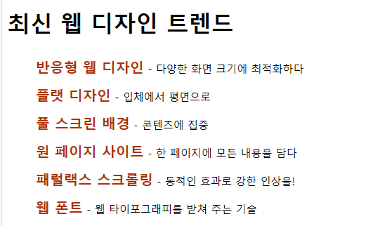
<h1>최신 웹 디자인 트렌드</h1>
<ul>
<li><span>반응형 웹 디자인</span> - 다양한 화면 크기에 최적화하다</li>
<li><span>플랫 디자인</span> - 입체에서 평면으로</li>
<li><span>풀 스크린 배경</span> - 콘텐츠에 집중</li>
<li><span>원 페이지 사이트</span> - 한 페이지에 모든 내용을 담다</li>
<li><span>패럴랙스 스크롤링</span> - 동적인 효과로 강한 인상을!</li>
<li><span>웹 폰트</span> - 웹 타이포그래피를 받쳐 주는 기술</li>
</ul>
</body>
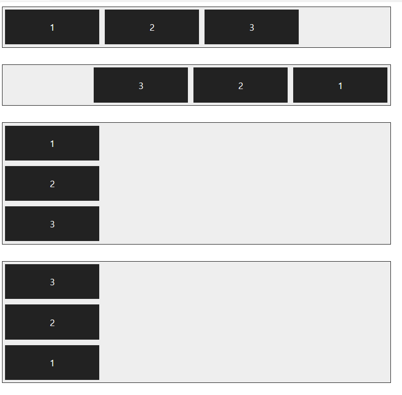
※ display: flex; flex-direction: row-reverse
display: flex; flex-direction: column-reverse
<head>
<style>
.con{background-color: aliceblue;
height: 100vh;
/* span 태그 처럼 일렬로 뜸(가로방향을 배치), 자신이 가진 width만큼 차지 */
display: flex; /* 가로로 한줄에 하나씩 뜨던 박스들이 세로로 한줄에 하나씩 뜨게 바뀜 */
flex-direction: row-reverse; /* 왼쪽에서부터 뜨던 박스들이 오른쪽부터 뜨게 바뀜 */
}
div.item1{background-color: red;}
div.item2{background-color: orange;}
div.item3{background-color: yellow;}
div.item4{background-color: green;}
div.item5{background-color: skyblue;}
</style>
</head>
<body>
<div class="con">
<div class="item1">1</div>
<div class="item2">2</div>
<div class="item3">3</div>
<div class="item4">4</div>
<div class="item5">5</div>
</div>
</body>

<head>
<style>
.container {
width:700px;
display:flex; /* 플렉스 컨테이너 지정 */
background-color:#eee;
border:1px solid #222;
margin-bottom:30px;
}
.box {
padding:5px 45px;
margin:5px;
width:80px;
background-color:#222;
}
#opt1{
flex-direction: row; /* 왼쪽에서 오른쪽으로 */
}
#opt2{
flex-direction: row-reverse; /* 오른쪽에서 왼쪽으로 */
}
#opt3{
flex-direction: column; /* 위에서 아래로 */
}
#opt4{
flex-direction: column-reverse; /* 아래에서 위로 */
}
p {
color:#fff;
text-align: center;
}
</style>
</head>
<body>
<div class="container" id="opt1">
<div class="box"><p>1</p></div>
<div class="box"><p>2</p></div>
<div class="box"><p>3</p></div>
</div>
<div class="container" id="opt2">
<div class="box"><p>1</p></div>
<div class="box"><p>2</p></div>
<div class="box"><p>3</p></div>
</div>
<div class="container" id="opt3">
<div class="box"><p>1</p></div>
<div class="box"><p>2</p></div>
<div class="box"><p>3</p></div>
</div>
<div class="container" id="opt4">
<div class="box"><p>1</p></div>
<div class="box"><p>2</p></div>
<div class="box"><p>3</p></div>
</div>
</body>
<head>
<meta charset="UTF-8">
<title>플렉스 박스 레이아웃</title>
<meta name="viewport" content="width=device-width, initial-scale=1">
<style>
.container {
display:flex; /* 플렉스 컨테이너 지정 */
background-color:#eee;
border:1px solid #222;
margin-bottom:30px;
}
.box {
padding:5px 45px;
margin:5px;
width:80px;
background-color:#222;
}
#opt1{
flex-wrap: nowrap; /* 한 줄에 표시 */
}
#opt2{
flex-wrap: wrap; /* 여러 줄에 표시 */
}
#opt3{
flex-wrap: wrap-reverse; /* 시작점과 끝점 바꿔 여러 줄에 표시 */
}
p {
color:#fff;
text-align: center;
}
</style>
</head>
<body>
<div class="container" id="opt1">
<div class="box"><p>1</p></div>
<div class="box"><p>2</p></div>
<div class="box"><p>3</p></div>
<div class="box"><p>4</p></div>
<div class="box"><p>5</p></div>
<div class="box"><p>6</p></div>
</div>
<div class="container" id="opt2">
<div class="box"><p>1</p></div>
<div class="box"><p>2</p></div>
<div class="box"><p>3</p></div>
<div class="box"><p>4</p></div>
<div class="box"><p>5</p></div>
<div class="box"><p>6</p></div>
</div>
<div class="container" id="opt3">
<div class="box"><p>1</p></div>
<div class="box"><p>2</p></div>
<div class="box"><p>3</p></div>
<div class="box"><p>4</p></div>
<div class="box"><p>5</p></div>
<div class="box"><p>6</p></div>
</div>
</body>

<head>
<meta charset="UTF-8">
<title>플렉스 박스 레이아웃</title>
<meta name="viewport" content="width=device-width, initial-scale=1">
<style>
.container {
display:flex;
background-color:#eee;
border:1px solid #222;
margin-bottom:10px;
}
#opt1{
flex-flow: row wrap; /* 왼쪽에서 오른쪽, 여러 줄 */
}
#opt2{
flex-flow: row nowrap; /* 왼쪽에서 오른쪽, 한 줄 */
}
.box {
padding:5px 45px;
margin:5px;
background-color:#222;
}
p {
color:#fff;
text-align: center;
}
</style>
</head>
<body>
<div class="container" id="opt1">
<div class="box"><p>1</p></div>
<div class="box"><p>2</p></div>
<div class="box"><p>3</p></div>
<div class="box"><p>4</p></div>
<div class="box"><p>5</p></div>
<div class="box"><p>6</p></div>
</div>
<div class="container" id="opt2">
<div class="box"><p>1</p></div>
<div class="box"><p>2</p></div>
<div class="box"><p>3</p></div>
<div class="box"><p>4</p></div>
<div class="box"><p>5</p></div>
<div class="box"><p>6</p></div>
</div>
</body>

<head>
<meta charset="UTF-8">
<title>플렉스 박스 레이아웃</title>
<meta name="viewport" content="width=device-width, initial-scale=1">
<style>
.container {
display:flex; /* 플렉스 컨테이너 지정 */
background-color:#eee;
border:1px solid #222;
margin-bottom:30px;
}
#opt1{
justify-content: flex-start; /* 주축 시작점 기준으로 배치 */
}
#opt2{
justify-content: flex-end; /* 주축 끝점 기준으로 배치 */
}
#opt3{
justify-content: center; /* 주축 중앙 기준으로 배치 */
}
#opt4{
justify-content: space-between; /* 시작점과 끝점 배치 후 중간 항목은 같은 간격으로 배치 */
}
#opt5{
justify-content: space-around; /* 전체 항목을 같은 간격으로 배치 */
}
.box {
padding:5px 45px;
margin:5px;
background-color:#222;
}
p {
color:#fff;
text-align: center;
}
</style>
</head>
<body>
<div class="container" id="opt1">
<div class="box"><p>1</p></div>
<div class="box"><p>2</p></div>
<div class="box"><p>3</p></div>
<div class="box"><p>4</p></div>
</div>
<div class="container" id="opt2">
<div class="box"><p>1</p></div>
<div class="box"><p>2</p></div>
<div class="box"><p>3</p></div>
<div class="box"><p>4</p></div>
</div>
<div class="container" id="opt3">
<div class="box"><p>1</p></div>
<div class="box"><p>2</p></div>
<div class="box"><p>3</p></div>
<div class="box"><p>4</p></div>
</div>
<div class="container" id="opt4">
<div class="box"><p>1</p></div>
<div class="box"><p>2</p></div>
<div class="box"><p>3</p></div>
<div class="box"><p>4</p></div>
</div>
<div class="container" id="opt5">
<div class="box"><p>1</p></div>
<div class="box"><p>2</p></div>
<div class="box"><p>3</p></div>
<div class="box"><p>4</p></div>
</div>
</body>

<head>
<meta charset="UTF-8">
<title>플렉스 박스 레이아웃</title>
<meta name="viewport" content="width=device-width, initial-scale=1">
<style>
.container {
width:100%;
height:150px;
display:flex;
background-color:#eee;
border:1px solid #222;
margin-bottom:20px;
}
#opt1{
align-items: flex-start; /* 교차축 시작점 기준으로 배치 */
}
#opt2{
align-items: flex-end; /* 교차축 끝점 기준으로 배치 */
}
#opt3{
align-items: center; /* 교차축 중앙 기준으로 배치 */
}
#opt4{
align-items: baseline; /* 문자 기준선에 맞춰 배치 */
}
#opt5{
align-items: stretch; /* 항목을 늘려 교차축에 가득차게 배치 */
}
.box {
padding:5px 45px;
margin:5px;
background-color:#222;
}
p {
color:#fff;
text-align: center;
}
</style>
</head>
<body>
<div class="container" id="opt1">
<div class="box"><p>1</p></div>
<div class="box"><p>2</p></div>
<div class="box"><p>3</p></div>
<div class="box"><p>4</p></div>
</div>
<div class="container" id="opt2">
<div class="box"><p>1</p></div>
<div class="box"><p>2</p></div>
<div class="box"><p>3</p></div>
<div class="box"><p>4</p></div>
</div>
<div class="container" id="opt3">
<div class="box"><p>1</p></div>
<div class="box"><p>2</p></div>
<div class="box"><p>3</p></div>
<div class="box"><p>4</p></div>
</div>
<div class="container" id="opt4">
<div class="box"><p>1</p></div>
<div class="box"><p style="font-size:14px;">2</p></div>
<div class="box"><p style="font-size:25px;">3</p></div>
<div class="box"><p style="font-size:10px">4</p></div>
</div>
<div class="container" id="opt5">
<div class="box"><p>1</p></div>
<div class="box"><p>2</p></div>
<div class="box"><p>3</p></div>
<div class="box"><p>4</p></div>
</div>
</body>

<head>
<meta charset="UTF-8">
<title>플렉스 박스 레이아웃</title>
<meta name="viewport" content="width=device-width, initial-scale=1">
<style>
.container {
width:450px;
height:150px;
background-color:#eee;
border:1px solid #222;
margin-bottom:20px;
display:flex; /* 플렉스 컨테이너 지정 */
align-items: center; /* 교차축의 중앙에 배치 */
}
.box {
padding:5px 45px;
margin:5px;
background-color:#222;
}
#box1 {
align-self: flex-start; /* 교차축의 시작점에 배치 */
}
#box3 {
align-self:stretch; /* 교차축에 가득 차게 늘림 */
}
p {
color:#fff;
text-align: center;
}
</style>
</head>
<body>
<div class="container">
<div class="box" id="box1"><p>1</p></div>
<div class="box"><p>2</p></div>
<div class="box" id="box3"><p>3</p></div>
<div class="box"><p>4</p></div>
</div>
</body>

<head>
<meta charset="UTF-8">
<title>플렉스 박스 레이아웃</title>
<meta name="viewport" content="width=device-width, initial-scale=1">
<style>
.container {
float:left;
width:200px;
height:150px;
display:flex; /* 플렉스 컨테이너 지정 */
flex-flow: row wrap; /* 왼쪽에서 오른쪽, 여러 줄 표시 */
border:1px solid #222;
background-color:#eee;
margin:30px;
}
#opt1{
align-content: flex-start; /* 교차축 시작점 기준 */
}
#opt2{
align-content: flex-end; /* 교차축 끝점 기준 */
}
#opt3{
align-content: center; /* 교차축 중앙 기준 */
}
#opt4{
align-content: space-between; /* 시작점과 끝점 배치 후 중간 항목은 같은 간격으로 배치 */
}
#opt5{
align-content: space-around; /* 전체 항목을 같은 간격으로 배치 */
}
#opt6{
align-content: stretch; /* 항목을 늘려 교차축에 가득 차게 배치 */
}
.box {
width:80px;
background-color:#222;
border:1px dotted #e9e9e9;
}
p {
color:#fff;
text-align: center;
}
</style>
</head>
<body>
<div class="container" id="opt1">
<div class="box"><p>1</p></div>
<div class="box"><p>2</p></div>
<div class="box"><p>3</p></div>
<div class="box"><p>4</p></div>
</div>
<div class="container" id="opt2">
<div class="box"><p>1</p></div>
<div class="box"><p>2</p></div>
<div class="box"><p>3</p></div>
<div class="box"><p>4</p></div>
</div>
<div class="container" id="opt3">
<div class="box"><p>1</p></div>
<div class="box"><p>2</p></div>
<div class="box"><p>3</p></div>
<div class="box"><p>4</p></div>
</div>
<div class="container" id="opt4">
<div class="box"><p>1</p></div>
<div class="box"><p>2</p></div>
<div class="box"><p>3</p></div>
<div class="box"><p>4</p></div>
</div>
<div class="container" id="opt5">
<div class="box"><p>1</p></div>
<div class="box"><p>2</p></div>
<div class="box"><p>3</p></div>
<div class="box"><p>4</p></div>
</div>
<div class="container" id="opt6">
<div class="box"><p>1</p></div>
<div class="box"><p>2</p></div>
<div class="box"><p>3</p></div>
<div class="box"><p>4</p></div>
</div>
</body>

<head>
<meta charset="UTF-8">
<meta name="viewport" content="width=device-width, initial-scale=1.0">
<title>세로로 중앙에 배치하기</title>
<style>
* {
margin:0;
box-sizing: border-box;
}
body {
background:url('마이멜로디.jpg') no-repeat left top fixed;
background-size:cover;
display: flex;
justify-content: center;
align-items: center;
min-height:100vh;
}
button {
background-color:#ccc;
font-size: 1.2em;
padding:1em 2em;
border:none;
border-radius:5px;
box-shadow:1px 1px 2px #fff;
}
</style>
</head>
<body>
<button>클릭!</button>
</body>

728x90
'네이버 클라우드 부트캠프 > 복습 정리' 카테고리의 다른 글
| 28일차 JavaScript [ 객체, 내장객체 ] (0) | 2024.03.29 |
|---|---|
| 27일차 JavaScript [ 출력, 함수 ] (0) | 2024.03.28 |
| 25일차 CSS [ 기본태그 ] (0) | 2024.03.26 |
| 24일자 HTML < 기본 태그, Visual Studio Code > (0) | 2024.03.25 |
| 23일차 JDBC [ DB MySQL과 eclipse 연동 ] (22일차와 연결해서 보기) (1) | 2024.03.22 |
'네이버 클라우드 부트캠프/복습 정리' Related Articles
more


